Configuring Forms
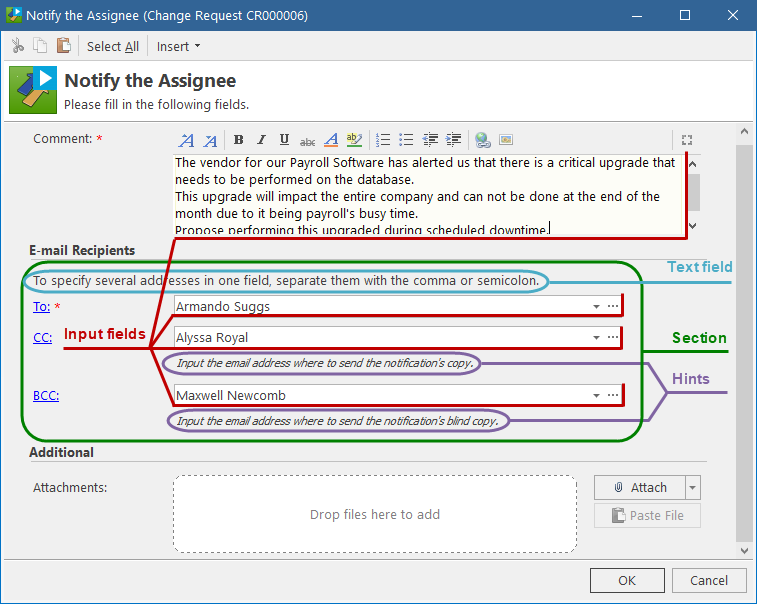
Forms are used in interactive "Create" and "Step" Actions for requesting user input through customizable pop-up dialog boxes or wizards. The main benefit of using Forms is that you can design them to request only the information needed for a specific situation.
IMPORTANT: This page describes Forms for interactive Actions. If you are configuring View Forms that the Self Service Portal (SSP) uses to display the object details, note that SSP View Forms do not support all aspects of Action Forms. For details, see Specifying workflow for the Self Service Portal.
Understanding Forms
Before you begin configuring, read this section to understand the following aspects of Forms:
Configuring Forms
You configure Forms for a particular object class in the Workflow and Business Logic > [Module] > [Object Class] > Workflow > Components > Forms section.
To configure a Form:
-
On the General tab, specify the general properties of the Form:
-
Object Class (read-only) - the object class for which the Form is created.
-
Name - the Form name.
-
Description - the description of the Form.
-
Form Caption - the caption of the dialog box or wizard displayed to the user. If you want to use the Action caption as the Form caption, keep this field clear.
-
Instruction - the introductory text displayed to the user at the top, right under the caption.
-
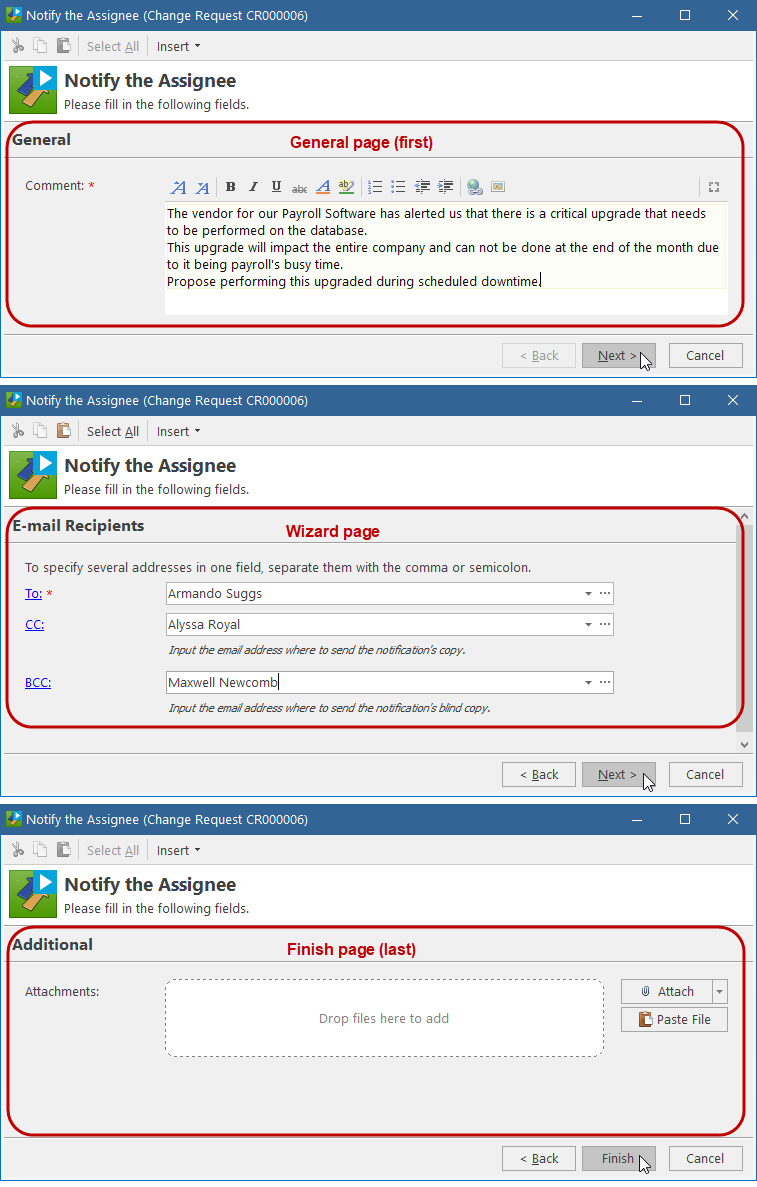
Window style - defines how the Form appears to the user: as a pop-up dialog box or as a wizard. For details, see Window style: dialog box or wizard above.
-
-
Under Fields, configure the Form contents. For details, see Form contents above.
-
New - click and select the element to add to the Form:
-
Field - brings up the Form Field window, where you can configure a new field on the Form.
-
Attachment Area - brings up the Attachment Area window, where you can configure a new control for attaching files to the object using the workflow form.
-
Section/Page - brings up the Section/Page window, where you can configure a new section for the dialog-style Form or a new page for the wizard-style Form.
NOTE: In addition to the wizard pages that you add explicitly, Alloy Navigator may implicitly create the first wizard page:
- General page - When there are some elements above the first page separator, they would appear on the first General wizard page. If you want a different caption for the first page, insert a page separator before the first field and specify the desired page caption. -
Text - brings up the Text window, where you can type in text or a hyperlink to be displayed on the Form.
-
Edit - opens the Form Field window, Section/Page window, Attachment Area window, or Text window, where you can modify the selected field, section/page caption, attachment area, or text.
TIP: You can first add fields and then organize your fields in sections (or wizard pages, if your Form has the wizard style). Alternatively, you can first add sections, or pages, and then add fields to them.
-
-
Delete - deletes the selected field, section/page separator, attachment area, or text.
-
Move Up / Move Down - moves the selected field, section/page separator, attachment area, or text up or down on the Form.
-
Copy / Paste commands in the pop-up menu - copy the selected section/page separator or text.
TIP: If you Form contains drop-down lists, you can filter list items using tags. For details, see Tagging list items.
NOTE: When you move or delete a section (a wizard page), you move or delete only the separator but not the fields.
-
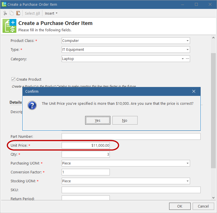
On the Validation tab, you can specify the validation criteria for the Form. For details, see Form validation above.
-
New - brings up the Validation window where you can configure a validation rule for checking the user input on the Form. For wizard-style Form, you can specify validation rules for particular wizard pages.
-
Edit - opens the Validation window where you can modify the selected validation rule.
-
Delete - deletes the selected rule.
-
Move Up / Move Down - changes the execution order of validation rules by moving the selected rule up or down.
-
On the Usage tab, view the workflow Actions that use this Form.
-
Open - opens the selected Action.
-
Click OK.


