Creating charts
Introduced in 2025.2
Updated in 2026
If existing charts do not meet your needs, you can create your own charts from scratch or based on existing charts. When creating a chart, you select a data source, configure grouping and metrics, add filters, and customize chart appearance and sharing settings.
You can create charts from the Reports > Analytics section or directly from dashboards, by copying existing charts or from scratch.
| To create charts | Use |
|---|---|
|
Create a new chart from the analytics chart library |
Reports > Analytics > + New Chart |
|
Create a chart while customizing a dashboard |
My Work > Dashboard > Customize Dashboard > New widget > Chart |
|
Create a chart based on an existing chart |
Open a chart from Reports > Analytics or a dashboard and click Save As |
IMPORTANT: Once a chart data source is selected, it cannot be changed. For example, a chart created for tickets cannot be converted into a chart for computers.
Create a chart
To create a chart:
-
Do one of the following:
-
In Reports > Analytics, click + New Chart.
-
On a dashboard, select Actions (three dots), then select New widget > Chart / Counter / Table.
-
-
Select a data source.
The data source defines, which records are included in the chart and which fields are available for grouping, metrics, filters, and display.
Available sources include individual object classes, such as
-
Click Next in the upper-right corner.
The chart opens with default settings and is ready to configure.
-
Use the Chart Settings pane on the right to configure the chart.
From this point, chart creation follows the same workflow as chart modification:
-
Configure the chart type, grouping, metrics, and displayed fields on the General tab
-
Configure chart filters on the Filter tab
-
For an Activity table, configure filters on the Object Filter and Activity Filter tabs
-
Customize chart appearance on the Options tab
-
Configure chart visibility and access on the Sharing tab
-
Assign the chart to categories on the Categories tab
You can also set default runtime filters. Viewers can change these filters when viewing the chart without affecting the chart filters configured on the Filter tab.
-
-
To finish chart creation, click Save.
If you decide not to keep the new chart, click Close, and then when prompted "Do you want to save the changes?", click No. You will return to the list of charts or dashboard.
Examples
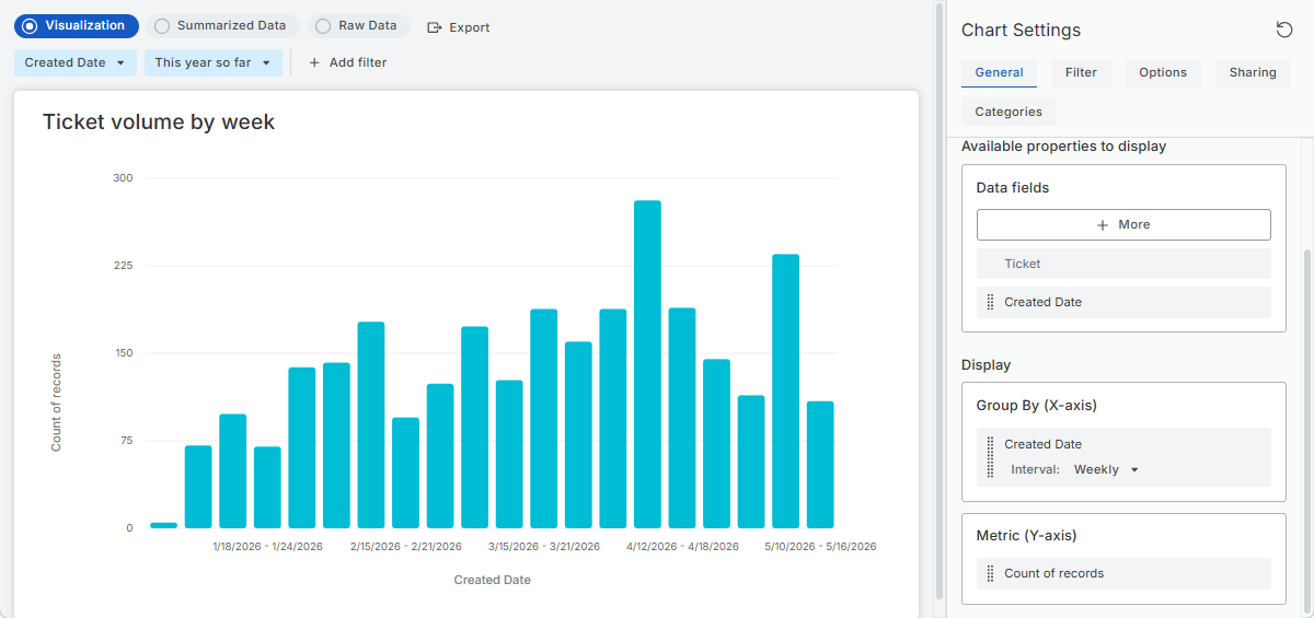
Example 1: Ticket volume by week
The following example creates a bar chart showing ticket volume by week, starting from the beginning of the year.
-
In Reports > Analytics, click + New Chart.
-
Select All Tickets as the data source and click Next in the upper-right corner.
-
In Chart Settings > General:
-
Keep Chart type to Vertical bar
-
Set Group By to Created Date with Weekly interval
-
Keep Metric to Count of records
-
-
In the runtime filter bar, select:
-
Created Date: This year so far
-
-
Optionally, customize chart appearance in the Options tab.
-
Click Save.
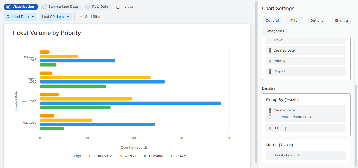
Example 2: Ticket volume by priority
The following example creates a horizontal bar chart showing ticket volume by priority for each month.
-
In Reports > Analytics, click + New Chart.
-
Select All Tickets as the data source.
-
In Chart Settings > General:
-
Set Chart type to Horizontal bar
-
Add Created Date to Group By and set the interval to Monthly
-
Under Available properties to display, add the Priority field and drag it to Group By
-
Keep Metric to Count of records
-
-
Optionally, customize chart colors and labels in the Options tab.
-
Optionally, in the runtime filter bar, select:
Created Date: Last 90 days
This sets the default time range to the last three months. Users can change it later when viewing the chart.
-
Click Save.
TIP: Try other chart types for the same data, such as Line or Area, to compare trends over time differently.
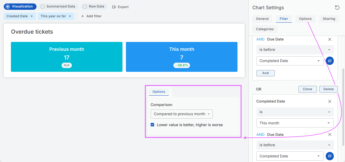
Example 3: Overdue tickets by month
The following example creates a Counter chart showing overdue tickets for the current month compared with the previous month.
-
In Reports > Analytics, click + New Chart.
-
Select All Tickets as the data source.
-
In Chart Settings > General:
-
Set Chart type to Counter
-
Under Available properties to display, add the Completed Date field
-
Drag Completed Date under Group By and select Monthly interval
-
Keep Metric to Count of records.
-
-
On the Filter tab, add these filters and combine them using Or:
-
Completed Date is Last month And Due date is before Completed Date
-
Completed Date is This month And Due date is before Completed Date
-
-
On the Options tab:
-
In the Comparison list, select Compare to previous month
-
Select the Lower value is better, higher is worse checkbox
-
Optionally, customize chart appearance
-
-
Click Save.