Basic UI elements
Introduced in 2023.2
The Type property is essential for defining form elements in Alloy Navigator, and is the only mandatory property. It consists of a predefined set of components, which can be either basic (elementary) or advanced (complex). This article focuses on the basic components, which serve as the fundamental building blocks for creating a form.
Elementary components can be used almost anywhere in the form layout. They are simple, flexible, and can be combined in various ways to create different parts of the form. The following elementary components are available, each described in detail in a separate section:
Tabs
The tabs component includes a list of tab components and defines a panel of tabs (see an example below):

Tab
The tab component is a key element in organizing form elements in Alloy Navigator forms. Each tab component groups related fields and sections together, allowing for a clean and structured form layout.
Row
Rows are horizontal sections within a column that group related elements together. They allow for a logical flow of information, making it easier to follow and fill out the form. For more details, see Customizing detail form styles.
Column
Columns are vertical sections within a form that help organize content side by side. They are used to create a multi-column layout, allowing for a structured and balanced distribution of form elements. For more details, see Customizing detail form styles.
Container
The container component is used to group other components of the field type into a cohesive section within a form. This allows for better organization and structure, making the form easier to navigate and understand.
Each container has a header, which displays the key. This key also serves as a localization key, enabling support for multiple languages.
Containers can be collapsible, allowing users to expand or collapse the section as needed for a cleaner and more manageable form layout.
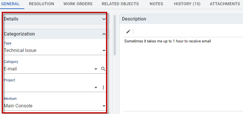
The example below shows a collapsible container with the Details header.

Field
Fields represent the individual data entry points within a form. Each field corresponds to a physical field of an object, allowing users to input or view data.
The key represents the field name and acts as an identifier in the form. It is used to link the field to the corresponding data in the object.
Calculated Field
The calculatedField component is visually identical to a regular field but differs in that it represents a calculated rather than a physical field. This means its value is derived from other data rather than being directly input by users.
The set of calculated fields is currently predefined and cannot be expanded by users. However, users can move calculated fields within the same object to rearrange the form layout. It is important that a calculated field remains in the same object, because its hard-coded data source is specific to a particular form. If a calculated field is inserted into a different form, it will not display because it is not compatible with other forms.
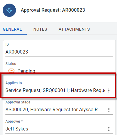
An example of the calculated field is the Applies to field in the Approval Requests form:

Label
The label component is an element that can be placed anywhere within a form. It displays text, which can be either a localization key adapts the text based on the user's language settings or a custom key.
Labels can be positioned anywhere in the form to provide context, instructions, or additional information.
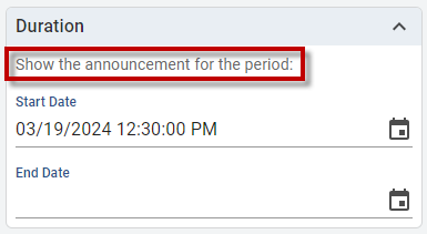
An example of the label is the text that appears under the Duration section in the Announcements form:

Button
The button component is named after its primary function and is used for performing actions within the system. There are only a few buttons in Alloy Navigator, and users cannot add custom buttons.
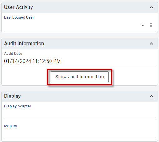
An example is the Show audit information button in Configuration Management > Computers > Configuration:
