Modifying charts
Introduced in 2025.2
Updated in 2026
Open a chart from Reports > Analytics or directly from a dashboard to modify its settings.
When a chart is opened, the Chart Settings pane appears on the right. Use it to change the chart type, displayed data, filters, formatting, sharing settings, and dashboard placement.
Changes are applied immediately in the chart preview.
NOTE: The chart data source cannot be changed. For example, a chart created for tickets cannot be converted into a chart for computers.
The screenshot below focuses on the Chart Settings pane used for chart configuration.
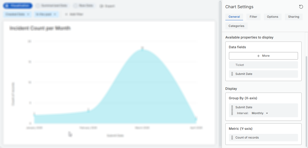
The Chart Settings pane includes the following tabs:
-
General: Chart structure and visualization
-
Filter: Records included in the chart
-
Options: Appearance and formatting
-
Sharing: Chart visibility and access
-
Categories: Chart organization in the Reports > Analytics section
-
Dashboards: Dashboards that use the chart as a widget
Activity-based Table charts also include:
-
Object Filter: Objects included in the activity table
-
Activity Filter: Activity records displayed for selected objects
General tab
Use the General tab to:
- name the chart;
- select a chart type;
- choose fields available for chart configuration;
- configure grouping and metrics.
Chart types
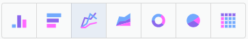
| Type | Best used for |
|---|---|
| Vertical bar |
Comparing categories |
| Horizontal bar | Comparing categories with long labels |
| Line |
Showing trends over time |
| Area |
Showing trends and volume over time |
| Donut |
Showing proportions as segments in a ring-shaped chart |
| Pie |
Showing proportions as slices of a whole |
| Counter | Displaying one or more calculated values, such as ticket counts or asset values |
| Table | Displaying detailed or grouped records |
You can switch chart types at any time, and the preview updates instantly so you can see how the data works in different formats.
Table type
Table charts support these types:
-
Summary tables: Grouped and aggregated data;
-
Raw data tables: Individual records.
Available properties to display
This section lists Data fields available for use in the chart: in Group By, Metric, and as table columns (for all charts in Row Data viewing mode and for Table charts)
Click More to browse and add additional fields from the dataset.
Each selected field appears with a drag handle that allows you to drag them into Group By or Metric or re-order table columns.
Display
Use the Display section to configure:
-
Group By: How records are grouped, for example by status, category, assignee, or date. If you group by a date field, you can group data by day, week, month, quarter, or year.
In bar and line chart types, Group By defines the X-axis, the categories displayed along the bottom of the chart. Multiple Group By fields can be added, allowing you to create nested or multi-level groupings.
Use the drag handles to reorder the grouping hierarchy.
-
Metric: Determines the numeric value calculated for each group. Most charts use count of records, but numeric fields allow calculations such as sum, average, minimum, or maximum.
In bar and line chart types, Group By defines the Y-axis, the value scale displayed along the left side.
Only one metric can be active at a time. To change it, drag a different numeric field from Data Fields into the Metric area, and the new value will automatically replace the existing metric.
Examples:
- Ticket count by status;
- Average resolution time by team;
- Asset cost by category.
Filter tab
Use the Filter tab to define which records are included in the chart. For example, you can filter records by status, assigned group, category, or location.
Unlike runtime filters in the chart viewer, filters configured on this tab are saved as part of the chart configuration and affect all viewers.
A filter includes:
- a field;
- an operator;
- one or more values, or another field for field-to-field comparisons.
Available fields and operators depend on the chart’s data source. For details, see Using operators in the Filter Builder.
TIP: To compare one field with another field, click Compare with another field  button. For details, see Comparing fields.
You can:
- add multiple filters;
- combine filters using And or Or;
- clone or delete existing filters.
Object Filter and Activity Filter tabs
Activity-based table charts include additional tabs for configuring which activities are displayed.
Object Filter
Use the Object Filter tab to define which objects are included in the activity table.
You can add
For example:
- tickets assigned to you or your team;
- tickets created by you.
Activity Filter
Use the Activity Filter tab to define which activity records are displayed for the selected objects.
For example:
- activities created by users other than you;
- activities with logged time;
- published activities.
Options tab
The Options tab controls the visual presentation of the chart. These settings do not change which records are included or how data is calculated.
Available options depend on the selected chart type and may include:
- selecting a color theme;
- configuring custom colors and labels for chart elements, with the option to restore default settings;
- showing or hiding the chart name;
- showing values on the chart;
- showing values as percentages of the whole;
- configuring custom labels for chart axes.
For Counter charts, you can also:
- Enable comparison indicators;
- Define whether increasing or decreasing values represent a positive trend;
- Limit the maximum number of displayed tiles.
Changes are applied immediately in the chart preview.
Dashboards tab
Charts added to dashboards as widgets display the Dashboards tab in the Chart Settings pane.
The Dashboards tab shows all dashboards that currently use the chart as a widget. From this tab, you can:
- see where the chart is used;
- open related dashboards directly from the list.
The Dashboards tab is informational only. Dashboard assignments cannot be changed from this tab.