Customize View pane
Introduced in 2023.1
Updated in 2026
This article describes the Customize View fly-out pane that provides a wide range of options to customize and refine the display of data in data views. This pane allows you to tailor the data view according to your specific needs, making it easier to analyze and interpret the data. By customizing the data view, you can focus on specific subsets of data, highlight important information, and extract meaningful insights more effectively.
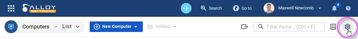
To open the Customize View pane, click the gear  button above the data view, in the upper-right corner.
The Customize View pane is organized into the following tabs:
-
Columns: Use this tab to specify the columns you want to include in the data view.
-
Filter: In this tab you can create filters for refining and narrowing down the data displayed in the view. This is particularly useful when dealing with large datasets or when specific subsets of data need to be analyzed or extracted.
-
Sharing: Here you can share the view with all technicians, selected users and/or groups, or keep it personal, ensuring it's shared only with you.
- Conditional Formatting: This tab allows you to apply custom formatting conditions for enhancing the visual representation of your data views.
To close the Customize View pane and return to the main view, click the X button located in the top right corner of the tab. This action closes the pane without applying any changes or filters to the data view. It provides a convenient way to exit the view customization mode and continue working with the data in the main view.
Columns tab
The Columns tab allows you to specify which record fields you want to display as columns in the data view and how to display them.
Adding columns
To choose which columns to include in the data view, select them from a list of available options. The list includes all the fields and attributes associated with the dataset you are working with. If the field you want to include is not visible in the initial list, click the + More button and choose the required field from the list.
Changing column order
You can also change the display order of the columns in the data view. To rearrange the columns, click anywhere inside the field that represents the column you want to move and drag it to the desired position in the column order. This action allows you to customize the visual arrangement of the columns based on your preferences or the specific needs of your analysis.
Removing columns
To remove a field from the display:
-
Locate the field you want to remove in the list of selected columns.
-
Click on the three vertical dots icon associated with that particular field. A menu with additional options is displayed.
-
Select Remove.
NOTE: Some fields, such as Flag Status and Ticket, are essential for the functioning of the data view and cannot be removed. The fields that cannot be removed do not have the three vertical dots menu associated with them.
In addition to selecting fields and customizing the order of columns, the three vertical dots icon associated with each field in the Columns tab offers further options to enhance the display and analysis of data: Summary and Group By.
Using the Summary option
The Summary option allows you to choose a footer value for the column. The footer value provides quick statistical information about the data contained within the column.
For instance, choosing the Count option displays the total number of records present in the column. This is useful for getting a sense of data completeness or identifying data discrepancies.
Selecting the Min option shows the minimum value in the column, allowing you to identify the smallest value present. This helps you determine the lower bounds or minimum threshold within the dataset, which can be valuable for analyzing trends or detecting outliers.
Opting for the Max option displays the maximum value in the column, enabling you to identify the highest value present. This provides insights into the upper bounds or maximum threshold within the dataset, which can be helpful for identifying peaks or exceptional data points.
Using the Group By option
The Group By option, accessible from the three vertical dots icon, is a handy tool for organizing and analyzing data based on specific criteria. Applying this option moves the respective field to the Group By section at the bottom of the tab. Alternatively, you can simply drag and drop a field into the Group By section.
Grouping data helps you gain insights by categorizing and aggregating information based on common attributes or values. This makes it easier to identify patterns, trends, and relationships within your dataset.
This option also allows you to define the order in which the grouping is applied. You can choose whether to group by the actual value of the field itself (the by value option) or by the count of records associated with each distinct value (the by count option).
Additionally, you can specify whether the grouping should be displayed in descending or ascending order, providing further control over the organization and presentation of the grouped data.
Filter tab
The Filter tab lets you define criteria that records must meet to be included in the data view. Filters can be applied to any available field.
Adding filters
To add a filter, proceed as follows:
-
Click on the + Add filter button. A list of all fields available in the dataset opens.
-
Select the filtering parameter you want to apply.
-
Choose an operator that defines the relationship between the filtering parameter and the filter value. The available set of operators varies based on the context and the data being filtered and depends on the specific filtering parameter selected. For details, see Using operators in the Filter Builder.
- Specify how the value is provided:
By default, the filter compares the field to a fixed value. For example, for a date field, you can select a specific date.
To compare the field with another field, click Compare with another field (
 ). The value input switches from a fixed value to a field selector.
-
Specify the filter value. To select multiple values simultaneously, hold the Ctrl key.
To refine the filtering further, you can combine multiple filters by clicking on the logical operators AND or OR. This allows you to create complex filtering conditions by adding additional filters.
For advanced users or those with specific filtering requirements, there is an option called Advanced Expression. This feature allows you to enter SQL conditions directly to create more intricate and customized filters. It gives you the flexibility to construct complex queries based on the underlying data structure and the filtering logic required.
Comparing fields
When Compare with another field is enabled, the filter compares two fields within the same record instead of comparing a field to a fixed value. Note that:
- Both fields must be of the same type (for example, date-to-date or person-to-person).
- A field cannot be compared with itself.
- For date fields, only direct comparisons are supported (for example, after or before another date). Relative offsets (such as “3 days later”) are not supported.
Examples:
- Actual Response Date is after Response Date
- Completed Date is after Due Date
- Requester equals Assignee
Additional options
In the Filter tab of the Customize View pane, several additional options are available to enhance the filtering experience.
-
Clone: This action creates an exact copy of the entire set of filters currently defined. The cloned filters are combined with the OR operator, which means that any data matching either the original filters or the cloned filters will be displayed. This feature is particularly useful when you want to create a similar filter with slight modifications without having to start from scratch.
-
Delete: To remove a specific filter from the set, click the X button next to the parameter name associated with that particular filter. This action removes the selected filter, excluding its criteria from the filtering process. To remove all filters at once, a Delete button is available. Clicking this button clears the entire set of filters, resulting in the display of the complete, unfiltered dataset.
Restoring applied filters
If you have made changes to the filters but want to revert to the original filter configuration, click  . This restores the last set of filters that were applied to the dat view.
Sharing tab
The Sharing tab allows you to share a personal view with a specific group of technicians or keep it personal.
-
Only me: The view is personal.
-
Everyone: The view is shared with all technicians.
-
Specific people or groups: The view is shared with selected users and/or groups. You can grant access to multiple individuals and multiple groups at the same time.
The concept of "view owner" ensures that the creator maintains uninterrupted access to their views, regardless of their group membership or sharing settings. The owner is always considered to have access and cannot be removed from the Specific people or groups list.
NOTE: Administrators with the Manage Shared Views and Boards permission can manage all shared views, regardless of their sharing settings or owner.
Conditional Formatting tab
Use this tab to create rules that change the look of rows or cells when certain conditions are met. This helps you spot important data quickly. For details, see Conditional formatting
Saving and applying changes
At the bottom of each tab there are three buttons that allow to determine the appropriate course of actions for your customizations:
-
Save: Saves the current customized view settings for future use. When you have configured the filters, columns, grouping, and other display options according to your preferences, clicking the Save button ensures that your changes are stored and can be accessed later. It preserves the specific configuration of the view, enabling you to quickly load and apply it whenever needed.
-
Save As: Provides the ability to create a new customized view based on the current settings. This option allows you to save multiple variations of the same view with different configurations. By clicking Save As, you can give the new customized view a distinct name, making it easy to identify and recall when required.
-
Apply: Applies the currently selected customized view settings to the data view. This enables you to instantly see the results of your customizations without having to navigate away from the Customize View pane.