Viewing charts
Introduced in 2025.2
Updated in 2026
Analytics charts help you explore data in real time. You can filter data, switch viewing modes, and review both high-level trends and detailed records.
To open a chart, go to Reports > Analytics and select a chart from the list. You can also open charts from dashboards using the View details (eye) icon on a chart widget.
Charts only display records available in your current workspace and accessible to you. Users viewing the same chart may see different results depending on their roles, permissions, and workspace access.
In the chart viewer, you can:
-
Apply runtime filters
-
Switch between viewing modes
To return to the chart list or dashboard, click Close in the upper-left corner.
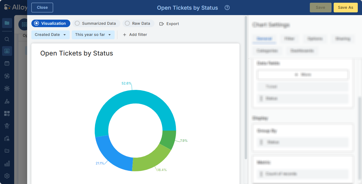
The screenshot below shows a chart opened from a dashboard. The chart settings pane on the right is blurred because this topic focuses on viewing charts.
Runtime filters
Runtime filters let you temporarily change the displayed data without modifying the chart configuration.
Each chart includes a default runtime filter, typically based on a date field and time range, such as Created Date: Last 30 days. This filter is available both in the chart viewer and on dashboard widgets using the chart.
When viewing a chart in Reports > Analytics, you can also click Add filter to apply additional temporary filters, such as status, category, priority, or assigned group.
Runtime filters only affect the current view and do not change the saved chart. Applied filters are also included in exported data and visualizations.
Viewing modes
Charts support three viewing modes. Use them to switch between visual analysis, summarized results, and underlying records.
| Mode | Description | Best used for |
|---|---|---|
| Visualization |
Displays the chart as a graph, counter, or table, depending on the selected chart type. Charts open in this mode by default. |
Viewing trends, proportions, and patterns |
| Summarized Data | Displays the same grouped and aggregated data as the visualization, but in a table format. Each row represents a group or category and its calculated metric values. Rows in this mode are read-only and cannot be opened. | Reviewing exact aggregated values behind the chart |
| Raw Data | Displays the individual records included in the chart results after filters are applied. You can scroll and page through the records. Rows in this mode are read-only and cannot be opened. | Reviewing and verifying the underlying data behind the chart |