Configuring Chart Widgets
A Chart widget displays a graphical chart built on the data retrieved from the Alloy Navigator
- View-based chart with drill-down support— a chart based on a shared view, which can be additionally filtered as needed. These charts provide drill-down capabilities. You can click a chart element to open the data view associated with that element.
- Static chart based on custom SQL— a static chart based on a custom SQL query. This type gives you maximum flexibility; however, static charts have no drill-down support.
NOTE: To zoom in a chart, right-click the chart in widget and choose Zoom In from the pop-up menu (or click the magnifier icon on the widget's toolbar).
To configure a Chart widget, follow the steps below:
- Create a new Chart widget or open an existing one for modifying. The Chart Widget Properties dialog box appears.
INFO: For instructions on adding or modifying dashboard widgets, see Creating and Modifying Dashboard Widgets.
- Specify the widget’s name in the Name field.
- Specify the widget’s title in the Title field. The title will be displayed in the widget's title bar on dashboards.
- If you want to allow technicians to minimize this widget, select the Allow to minimize widget check box.
- In the Chart Data section, select the chart data source type: View-based chart with drill-down support or Static chart based on custom SQL.
- If you want to create a chart with drill-down support based on an existing shared view as the data source, follow these steps:
- Click Select to bring up the Select View dialog box, and then choose a shared view that will serve as the data source.
- Select a field for grouping data records in the Group by drop-down list. Values will be labels of the horizontal (X) axis. You can click Preview to preview the chart itself and view the chart source table.
- If you want to build a chart with multiple data series grouped by two levels, select a field for second-level grouping in the Then by drop-down list. In this case, the values of the Group by field selected in the previous step will become series names (shown in the legend) and the values of the Then by field will be horizontal X axis labels.
For example, if you want to create a chart displaying Tickets of various
NOTE: You can click Preview to preview the chart itself as well as the chart source table.
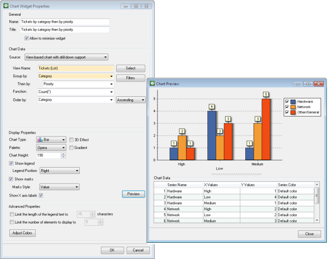
- By default, charts use the Count(*) aggregation function for generating vertical (Y) axis values for each X value. However, you can select another aggregation function such as Min, Max, Sum, Average in the Function drop-down list.
- In the Order by drop-down list, select the field for sorting chart elements on the X axis, and then specify the sorting order (Ascending or Descending).
- If you want to filter chart data, click Filters and configure one or more chart filters using the Manage Chart Filters dialog box. For details, see Creating Chart Filters.
- If you want to create a static chart that uses a custom SQL query as the chart source, under Enter the SQL query..., specify the SQL query for retrieving data.
The following two types of SQL queries are allowed:
- A SQL query that returns two columns. In this case, the chart shows a single data series. The first column contains horizontal axis labels and the second column contains data series. For example:
select Priority, count(*) from Ticket_List group by Priority - A SQL query that returns three columns. In this case, the chart displays multiple data series. The first column provides series names (shown in the legend), the second column contains horizontal axis labels, and the third one contains data series. For example:
select Category, Priority, count(*) from Ticket_List group by Category, PriorityNOTE: You can click Preview to preview the chart itself as well as the chart source table.
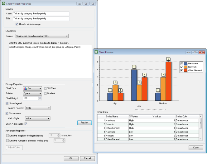
- A SQL query that returns two columns. In this case, the chart shows a single data series. The first column contains horizontal axis labels and the second column contains data series. For example:
- Under Display Properties, specify visual options of the chart:
- Specify the Chart Type: either Bar, Line, or Pie.
- By default, charts appear flat. If you want your chart to appear in 3D, select the 3D Effect check box.
- In the Palette drop-down list, select one of pre-defined color palettes.
- If you want to apply the gradient effect, select the Gradient check box.
- By default, charts are 190 pixels high. You can adjust the height of your chart by specifying a custom value in the Chart Height field.
- By default, chart displays the legend on the right. You can choose a different position from the Legend Position drop-down list. If you want to hide the legend, clear the Show legend check box.
- By default, chart displays marks, i.e. small boxes with values next to chart elements. You can choose a different appearance using the Marks Style drop-down list. If you want to hide the marks, clear the Show marks check box.
- By default, X axis labels are shown in the chart. When there are too many different values, their labels may overlap. You can hide horizontal axis labels by clearing the Show X axis labels check box.
- To see how the chart will look like, click Preview. The Chart Preview dialog box appears to show the chart and the data it is based on. You can also perform additional customization here:
- You can customize the color for a particular chart series as follows:
- Under Chart Data, click in the cell of the Color column for the chart series and select the desired color from the drop-down list. Alternatively, you can click the ellipsis button to bring up the Color dialog box and select one of palette colors, or define a custom one. The preview pane immediately displays your changes.
- You can restore the default color by selecting Default color in the Color column cell for the chart series.
NOTE: You can adjust chart colors later. For details, see Customizing Chart Colors.
- When your chart has multiple filter options, you can switch between filters and preview the chart with different filtering conditions. Click the filter selector button in the upper-right corner and choose another filter from the drop-down list.
To close the Chart Preview dialog box and save your color changes, click OK.
- Your chart may have long series names, which makes the legend too large and the chart too small. To limit the width of the legend area, under Advanced Properties, select the Limit the length of the legend to check box and specify the maximum width in characters. Shortened text will appear with an ellipsis at the end.
NOTE: For bar or line charts consisting of a single data series, this option limits the width of chart element captions.
- When the names of data series are too long, the legend may become too wide and cause the chart to shrink down. To limit the number of displayed elements, select the Limit the number of elements to display to check box and specify the limit. When the number of elements exceeds the limit (N), the chart will display only the first N of them. The data retrieval order is specified in the chart source definition within the Chart Data section.
- Click OK.