Administration Guide
Customizing Chart Colors
By default, charts use colors from the predefined palette that you select when configuring chart properties.
INFO: For details, see Configuring Chart Widgets.
You can customize the color for an individual chart series as follows:
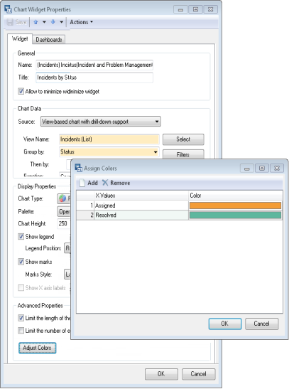
- From the Sidebar, navigate to General > Dashboard Management > Widgets > Charts.
- Double-click the chart widget to bring up the Chart Widget Properties dialog box.
- Click Adjust Colors. The Assign Colors dialog box opens.
- Click Add. A new row appears.
- Select the series name in the Series Name (or X Values) cell.
If you want to specify the color for a series that is not currently displayed in the chart, type the name of the data series in the cell.
- In the Color cell, select a color from the drop-down. The list contains standard colors from the active palette. If you want to specify a custom color, click the ellipsis button to bring up the Color dialog box, then define a new color.
NOTE: You can always restore the default color by choosing Default color in the Color cell.
- Click OK.